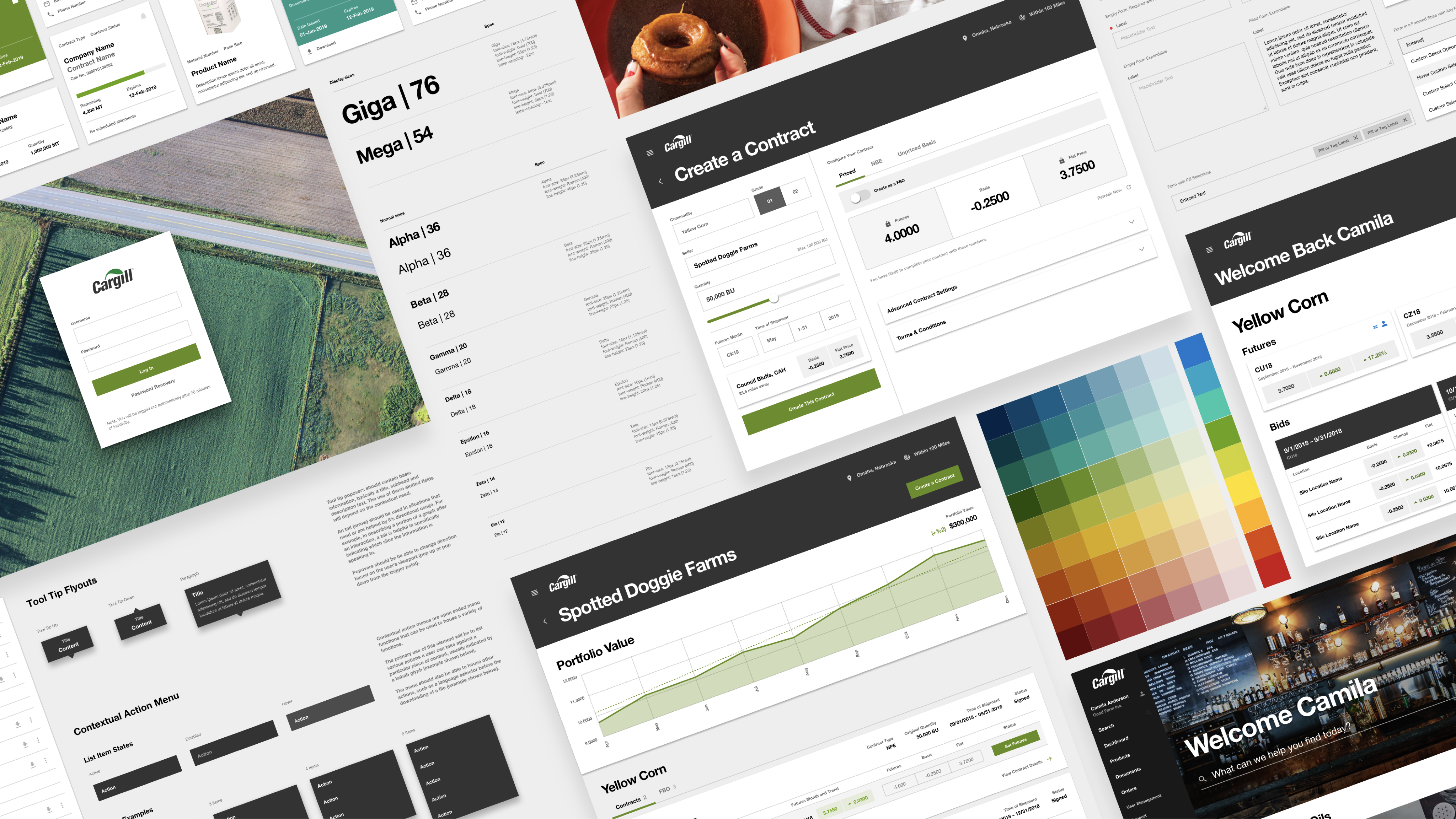
Cargill is one of the largest companies in the world, playing a crucial role in the global food, agriculture, and nutrition industries. With operations in over 70 countries, they provide everything from grains and oilseeds to protein and food ingredients, all while focusing on sustainability and innovation. Whether it's helping farmers thrive or creating solutions for food manufacturers, Cargill is a key player in ensuring the world’s food supply chain works.

As with many monolithic organizations, Cargill’s design language and strategy lacked definition, leading to inefficiencies and a lack of cohesion in how the brand’s products and tools worked across business units and regions. When a brand lacks definition, it forces individual groups to devise and build their own solutions, which means repeated effort in design and development work, on a global scale.
Maintaining a unified design language across countless digital platforms is no easy task, not to mention regional differences in user expectations. We needed to build a global design system, but we also needed to develop an adoption strategy as well as a governance model and team to continue as dedicated shepherds for the design system.
After first doing a complete audit of the existing platforms, tools, and interfaces, we sat down with the corporate brand team at Cargill in order to work towards an agreed upon set of foundational design elements that should be universally followed across every
From there, our strategy was to take a single business unit, redesign whatever tools and platforms they required, and use that frame of reference to begin laying out the structure of the entire design system.
We then took the work back into the organization to sell additional groups via our adoption strategy. With each group signed on, we would build, adjust, or expand upon that patterns already in place to accommodate the next groups’ needs. Since everything Cargill does is apart of the broader, global supply chain, our design system acted at times as a literal piece of connective tissue due to our abstracted, systemic approach to design (i.e. a ‘shipment’ can require different information based on the business context, but with a design system, we can set a rubric of what a ‘shipment’ should look like and a lowest-common-denominator set of attributes and styles that should be applied).
With this overall process executed upon, we then proved in real-time the process of both our adoption strategy and the governance model, in that we were teaching Cargill how to bring additional business units into the fold, as well as how to evolve the design system’s component language.
My role on the project at the start was as the principal designer, handling all of the design system construction, style definition, and the beginnings of the governance model. The initial team was small, consisting only of myself, another talented designer focused on UX, and our lead creative director providing oversight and authoring the adoption strategy. As the project gained momentum within the organization, we spun up additional design and development pods to replicate our process at scale. Further into the process, I became the defacto design system governor, overseeing the other designer’s work, and providing insight into how the component library should be used, modified, and expanded upon.
At the time of my departure from the work, the design system had been adopted by a majority of the organization, proving the adoption workflow and governance model a success within Cargill. This not only was a huge improvement for design quality and efficiency, but also created a rallying effect, raising moral and pride in the products and services.
The unexpected benefit of the work was in smaller, agile teams being able to rapidly prototype new solutions for their business needs without needing to obtain massive investment from department heads. If all the tools are readily available to create and test with, more focus and energy can be given to the problem at hand, and less on reinventing the wheel.
Automate and streamline vehicle maintenance
→ View the Case Study
Building Cargill's Global Design System
→ View the Case Study
Tools to guide complex conversation
→ View the Case Study
Reimagining a digital art community.
→ View the Case Study